Life Expectancy by Census Tract in New York State
By
NYHealth
Funding Area
Other
Date
October 22, 2020

Introduction & Key Findings
Between 1990 and 2020, life expectancy increased significantly throughout the United States. This was especially the case in New York State, where life expectancy increased from 74.7 years to 80.4 years during this time period.
Life expectancy is an important indicator of the quality of life and overall health of a community and reflects physical health, mental health, and individual behaviors, as well as socioeconomic conditions, the quality of the health care system, and other local environmental factors. Analyzing national and state trends can mask important disparities in life expectancy at a more local level.
This NYHealth issue brief presents a granular analysis that examines sub-county variation for the nearly 5,000 census tracts throughout New York State; explores the relationship between life expectancy and demographic and socioeconomic factors in New York; and highlights neighborhoods that defy expected patterns and examines potential factors that may protect against premature mortality.
Key Takeaways:
- There is nearly a 35-year difference in life expectancy between the census tracts in New York State with the shortest and longest life expectancies, just a few miles apart in New York City.
- There is also extensive variation in life expectancy across census tracts within counties. On average, there was approximately a 20% difference between the census tracts with the longest and shortest life expectancies within each of the counties in New York State.
- Even in counties with low average life expectancy, census tracts within them sometimes have some of the highest life expectancies in the State. In Bronx County, which has the second-lowest county life expectancy in the State, more than 70 census tracts have life expectancies longer than the population-weighted statewide average.
- Many factors, including income, socioeconomic status, race, and education, are associated with life expectancy.
- Although income and other socioeconomic status factors are strongly associated with life expectancy, there are important exceptions. Not all communities with low incomes or socioeconomic status have low life expectancies. For example, more than one-third of New Yorkers living in census tracts with the highest life expectancies have median household incomes of less than $50,000.
- Some communities may be benefiting from external influences that spill over from more affluent nearby census tracts. Factors beyond income and socioeconomic status—such as individual health behaviors and immigration status—may also play important roles in life expectancy.
Life Expectancy Variation by Census Tract
There is Wide Variation in Life Expectancy across Communities in New York State
The census tracts in Figure 1 are categorized into five quintiles based on the statewide distribution of life expectancy estimates by census tract. In general, census tracts in each of the five quintiles are spread throughout the State. Although counties closer to New York City tend to have higher county average life expectancies,[1] there is no clear trend when comparing the average life expectancies of urban and rural census tracts (see Table 1). The most urban census tracts in the State have an average life expectancy of 80.8 years, while the most rural census tracts have an average life expectancy of 80.9 years. There is a wider range of life expectancy among urban census tracts; however, that is at least partially a product of there being many more urban census tracts, which creates more opportunity for variation.
There is nearly a 35-year difference in life expectancy between the census tracts with the shortest and longest life expectancies in the State. It so happens that these census tracts represent neighborhoods just a few miles apart in New York City: one in the northern half of Roosevelt Island (59.0 years) and the other in a section of Chinatown in lower Manhattan (93.6 years). This is the largest range in life expectancy by census tract for any state in the country (data not shown).
[1] New York Health Foundation. 2017. Trends in Life Expectancy for New Yorkers. https://nyhealthfoundation.org/resource/trends-life-expectancy-new-yorkers/.
Figure 1. Variation in Life Expectancy by Census Tract in New York State
Figure 1. Variation in Life Expectancy by Census Tract in New York State

var divElement = document.getElementById(‘viz1586525733612’); var vizElement = divElement.getElementsByTagName(‘object’)[0]; vizElement.style.width=’100%’;vizElement.style.height=(divElement.offsetWidth*0.75)+’px’; var scriptElement = document.createElement(‘script’); scriptElement.src = ‘https://public.tableau.com/javascripts/api/viz_v1.js’; vizElement.parentNode.insertBefore(scriptElement, vizElement);
Source: Life expectancy data are available at: https://www.cdc.gov/nchs/nvss/usaleep/usaleep.html.
Notes: Life expectancy data span mortality and population data from 2010 through 2015. Only census tracts with available life expectancy estimates are included in the analysis (n=4,547).
Table 1. Life Expectancy Estimates for Urban and Rural Census Tracts in New York State
| Urban/
Rural Category |
Description | Number of Counties | Number of Census Tracts | Average Life Expectancy | Minimum Life Expectancy for Census Tract | Maximum Life Expectancy for Census Tract |
| 1
(most urban) |
Counties in metro areas of 1 million population or more | 20 | 3,529 | 80.8 | 59.0 | 93.6 |
| 2 | Counties in metro areas of 250,000 to 1 million population | 12 | 512 | 80.1 | 66.2 | 91.7 |
| 3 | Counties in metro areas of fewer than 250,000 population | 6 | 136 | 80.4 | 68.5 | 88.5 |
| 4 | Urban population of 20,000 or more | 11 | 220 | 80.0 | 68.4 | 89.8 |
| 5
(most rural) |
Urban population of 2,500 to 19,999, or
Completely rural or less than 2,500 urban population, adjacent to a metro area |
13 | 150 | 80.9 | 72.4 | 90.8 |
Source: Life expectancy data are available at: https://www.cdc.gov/nchs/nvss/usaleep/usaleep.html.
Census tract population data are available from U.S. Census Bureau, 2011 through 2015 American Community Survey 5-Year Estimates, table B01003.
Urban/rural data are available from the U.S. Department of Agriculture’s 2013 Rural-Urban Continuum Codes.
Notes: Life expectancy data span mortality and population data from 2010 through 2015. Only census tracts with available life expectancy estimates are included in the analysis (n=4,547). Life expectancy averages are calculated based on a population-weighted average of the census tract life expectancy estimates. The urban/rural designations are composites of the U.S. Department of Agriculture’s 2013 Rural-Urban Continuum Codes (RUCC). More details about the reclassification of RUCC are available in the Methods section.
Executive Summary & Expected Impact of COVID-19
Executive Summary
Life expectancy is an important indicator of the quality of life and overall health of a community. Life expectancy reflects physical health, mental health, and individual behaviors, as well as socioeconomic conditions, the quality of the local health care system, and other local environmental factors. All New Yorkers have the right to a long and healthy life, and disparities in life expectancy across communities pose a critical barrier to achieving health equity statewide.
Life expectancy increased significantly throughout the United States between 1990 and 2010. That was especially the case in New York State, where life expectancy increased from 74.7 years to 80.4 years during this time period, leapfrogging the national life expectancy estimate. A prior NYHealth data brief describes reasons for the marked improvement. That report also outlines concerns regarding future growth in life expectancy after a plateau during the 2010s; since 2010, life expectancy estimates have hovered between 80 and 81 years in New York State.[1]
Analyzing national and State trends can mask important disparities in life expectancy at a more local level. A 2017 NYHealth report highlighted differences in life expectancy across New York State counties. Life expectancy in the counties with the longest (Rockland) and shortest (Sullivan) estimates in New York State differed by more than four years.[2] Even larger differences have been documented at the sub-county level in New York City.[3]
Expected Impact of COVID-19 on Life Expectancy
The COVID-19 pandemic is likely to increase disparities in life expectancy across the State. New York City was an epicenter for the first surge of COVID-19.[4] Approximately two-thirds of those who have died in New York State from COVID-19 were New York City residents.[5] As of October 2020, New York City and surrounding counties continue have had the highest total number of cases in the State.[6] One early estimate suggests that life expectancy could be reduced by five years in New York City because of the pandemic, negating much of the gain in life expectancies over the last two decades.[7],[8]
Even within counties, the pandemic is expected to increase disparities in life expectancy, as certain communities have been disproportionately affected by COVID-19. Within New York City, ZIP codes with high concentrations of Black and Latino people, as well as low-income residents, suffered the highest death rates, while wealthier areas and those with a greater proportion of white people generally experienced the lowest rates in the City.[9] Researchers have pointed to factors such as underlying comorbid illnesses, occupational exposures, socioeconomic determinants, and race-based structural inequities to explain the disparate outcomes among the boroughs.[10]
Although the estimates for life expectancy used in this brief predate the pandemic, the data discussed provide an indication of how life expectancy differs at the neighborhood level throughout the State. These data can also point to neighborhoods that are particularly at risk of lowered life expectancy because of COVID-19. More specifically, sub-county variation is examined for the nearly 5,000 census tracts throughout New York State, using data from the U.S. Small-area Life Expectancy Estimates Project (USALEEP). Census tracts are small subdivisions of a county that average about 4,000 residents. The USALEEP produced estimates of life expectancy at birth for most of the census tracts in the United States for the period 2010 through 2015. More details about the data are available in the Methods section.
Also examined is the relationship between life expectancy and demographic and socioeconomic factors in New York State. These factors, however, do not tell the full story of why some New York residents live longer than others. Using the Bronx as a case study, the brief highlights neighborhoods that defy expected patterns and experience higher-than-predicted longevity. By studying the geospacial distribution of these neighborhoods, we theorize factors that may protect against premature mortality. We also invite readers to use the interactive census tract map in the brief to examine life expectancy patterns and aberrations in their own neighborhoods.
[1] New York Health Foundation. 2018. Losing Ground: Life Expectancy Trends in New York State. https://nyhealthfoundation.org/resource/losing-ground-life-expectancy-trends-in-new-york-state/.
[2] New York Health Foundation. 2017. Trends in Life Expectancy for New Yorkers. https://nyhealthfoundation.org/resource/trends-life-expectancy-new-yorkers/.
[3] New York City Department of Health and Mental Hygiene. New York City Health Profiles. Accessed February 7, 2017. https://www1.nyc.gov/site/doh/data/data-publications/profiles.page.
[4] Armstrong, D, Goldman, H, and Clukey, K. May 29, 2020. Bloomberg News. Coronavirus: Why New York Was Hit Harder Than Other Cities. Accessed August 16, 2020 at: https://www.govtech.com/em/safety/Coronavirus-Why-New-York-was-hit-so-Hard-Compared-to-Other-Cities.html.
[5] New York State Department of Health. COVID-19 Tracker. Accessed October 20, 2020 at: https://covid19tracker.health.ny.gov/views/NYS-COVID19-Tracker/NYSDOHCOVID-19Tracker-Fatalities?%3Aembed=yes&%3Atoolbar=no&%3Atabs=n.
[6] Centers for Disease Control and Prevention. Cases & Deaths by County. Accessed Accessed October 20, 2020 at: https://www.cdc.gov/coronavirus/2019-ncov/cases-updates/county-map.html.
[7] New York City Department of Health and Mental Hygiene. 2013. Increased Life Expectancy in New York City: What Accounts for the Gains?. Accessed August 16, 2020 at: https://www1.nyc.gov/assets/doh/downloads/pdf/epi/epiresearch-lifeexpectancy.pdf.
[8] Resolve to Save Lives. 2020. Estimated impact of COVID-19 on life expectancy in New York City. Accessed August 16, 2020 at: https://preventepidemics.org/covid19/science/insights/life-expectancy-in-new-york-city/.
[9] Schwirtz, M and Cook, LR. May 22, 2020. These N.Y.C. Neighborhoods Have the Highest Rates of Virus Deaths. New York Times. Accessed August 16, 2020 at: https://www.nytimes.com/2020/05/18/nyregion/coronavirus-deaths-nyc.html.
[10] Adhikari, S., Pantaleo, N. P., Feldman, J. M., Ogedegbe, O., Thorpe, L., & Troxel, A. B. (2020). Assessment of community-level disparities in coronavirus disease 2019 (COVID-19) infections and deaths in large US metropolitan areas. JAMA network open, 3(7), e2016938-e2016938.
Life Expectancy Variation by Census Tract
There is Wide Variation in Life Expectancy across Communities in New York State
The census tracts in Figure 1 are categorized into five quintiles based on the statewide distribution of life expectancy estimates by census tract. In general, census tracts in each of the five quintiles are spread throughout the State. Although counties closer to New York City tend to have higher county average life expectancies,[1] there is no clear trend when comparing the average life expectancies of urban and rural census tracts (see Table 1). The most urban census tracts in the State have an average life expectancy of 80.8 years, while the most rural census tracts have an average life expectancy of 80.9 years. There is a wider range of life expectancy among urban census tracts; however, that is at least partially a product of there being many more urban census tracts, which creates more opportunity for variation.
There is nearly a 35-year difference in life expectancy between the census tracts with the shortest and longest life expectancies in the State. It so happens that these census tracts represent neighborhoods just a few miles apart in New York City: one in the northern half of Roosevelt Island (59.0 years) and the other in a section of Chinatown in lower Manhattan (93.6 years). This is the largest range in life expectancy by census tract for any state in the country (data not shown).
[1] New York Health Foundation. 2017. Trends in Life Expectancy for New Yorkers. https://nyhealthfoundation.org/resource/trends-life-expectancy-new-yorkers/.
Figure 1. Variation in Life Expectancy by Census Tract in New York State
var divElement = document.getElementById(‘viz1586525733612’); var vizElement = divElement.getElementsByTagName(‘object’)[0]; vizElement.style.width=’100%’;vizElement.style.height=(divElement.offsetWidth*0.75)+’px’; var scriptElement = document.createElement(‘script’); scriptElement.src = ‘https://public.tableau.com/javascripts/api/viz_v1.js’; vizElement.parentNode.insertBefore(scriptElement, vizElement);
Source: Life expectancy data are available at: https://www.cdc.gov/nchs/nvss/usaleep/usaleep.html.
Notes: Life expectancy data span mortality and population data from 2010 through 2015. Only census tracts with available life expectancy estimates are included in the analysis (n=4,547).
Table 1. Life Expectancy Estimates for Urban and Rural Census Tracts in New York State
| Urban/ Rural Category | Description | Number of Counties | Number of Census Tracts | Average Life Expectancy | Minimum Life Expectancy for Census Tract | Maximum Life Expectancy for Census Tract |
| 1 (most urban) | Counties in metro areas of 1 million population or more | 20 | 3,529 | 80.8 | 59.0 | 93.6 |
| 2 | Counties in metro areas of 250,000 to 1 million population | 12 | 512 | 80.1 | 66.2 | 91.7 |
| 3 | Counties in metro areas of fewer than 250,000 population | 6 | 136 | 80.4 | 68.5 | 88.5 |
| 4 | Urban population of 20,000 or more | 11 | 220 | 80.0 | 68.4 | 89.8 |
| 5 (most rural) | Urban population of 2,500 to 19,999, or Completely rural or less than 2,500 urban population, adjacent to a metro area | 13 | 150 | 80.9 | 72.4 | 90.8 |
Source: Life expectancy data are available at: https://www.cdc.gov/nchs/nvss/usaleep/usaleep.html. Census tract population data are available from U.S. Census Bureau, 2011 through 2015 American Community Survey 5-Year Estimates, table B01003. Urban/rural data are available from the U.S. Department of Agriculture’s 2013 Rural-Urban Continuum Codes.
Notes: Life expectancy data span mortality and population data from 2010 through 2015. Only census tracts with available life expectancy estimates are included in the analysis (n=4,547). Life expectancy averages are calculated based on a population-weighted average of the census tract life expectancy estimates. The urban/rural designations are composites of the U.S. Department of Agriculture’s 2013 Rural-Urban Continuum Codes (RUCC). More details about the reclassification of RUCC are available in the Methods section.
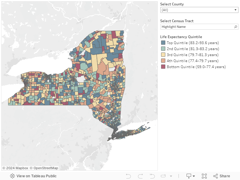
Life Expectancy Variation by Census Tract [map]
Life Expectancy Variation by Census Tract
There is Wide Variation in Life Expectancy across Communities in New York State
The census tracts in Figure 1 are categorized into five quintiles based on the statewide distribution of life expectancy estimates by census tract. In general, census tracts in each of the five quintiles are spread throughout the State. Although counties closer to New York City tend to have higher county average life expectancies,[1] there is no clear trend when comparing the average life expectancies of urban and rural census tracts (see Table 1). The most urban census tracts in the State have an average life expectancy of 80.8 years, while the most rural census tracts have an average life expectancy of 80.9 years. There is a wider range of life expectancy among urban census tracts; however, that is at least partially a product of there being many more urban census tracts, which creates more opportunity for variation.
There is nearly a 35-year difference in life expectancy between the census tracts with the shortest and longest life expectancies in the State. It so happens that these census tracts represent neighborhoods just a few miles apart in New York City: one in the northern half of Roosevelt Island (59.0 years) and the other in a section of Chinatown in lower Manhattan (93.6 years). This is the largest range in life expectancy by census tract for any state in the country (data not shown).
Figure 1. Variation in Life Expectancy by Census Tract in New York State
var divElement = document.getElementById(‘viz1603207203058’); var vizElement = divElement.getElementsByTagName(‘object’)[0]; vizElement.style.width=’100%’;vizElement.style.height=(divElement.offsetWidth*0.75)+’px’; var scriptElement = document.createElement(‘script’); scriptElement.src = ‘https://public.tableau.com/javascripts/api/viz_v1.js’; vizElement.parentNode.insertBefore(scriptElement, vizElement);
Source: Life expectancy data are available at: https://www.cdc.gov/nchs/nvss/usaleep/usaleep.html.
Notes: Life expectancy data span mortality and population data from 2010 through 2015. Only census tracts with available life expectancy estimates are included in the analysis (n=4,547).
Table 1. Life Expectancy Estimates for Urban and Rural Census Tracts in New York State
| Urban/ Rural Category | Description | Number of Counties | Number of Census Tracts | Average Life Expectancy | Minimum Life Expectancy for Census Tract | Maximum Life Expectancy for Census Tract |
| 1 (most urban) | Counties in metro areas of 1 million population or more | 20 | 3,529 | 80.8 | 59.0 | 93.6 |
| 2 | Counties in metro areas of 250,000 to 1 million population | 12 | 512 | 80.1 | 66.2 | 91.7 |
| 3 | Counties in metro areas of fewer than 250,000 population | 6 | 136 | 80.4 | 68.5 | 88.5 |
| 4 | Urban population of 20,000 or more | 11 | 220 | 80.0 | 68.4 | 89.8 |
| 5 (most rural) | Urban population of 2,500 to 19,999, or Completely rural or less than 2,500 urban population, adjacent to a metro area | 13 | 150 | 80.9 | 72.4 | 90.8 |
Source: Life expectancy data are available at: https://www.cdc.gov/nchs/nvss/usaleep/usaleep.html. Census tract population data are available from U.S. Census Bureau, 2011 through 2015 American Community Survey 5-Year Estimates, table B01003. Urban/rural data are available from the U.S. Department of Agriculture’s 2013 Rural-Urban Continuum Codes.
Notes: Life expectancy data span mortality and population data from 2010 through 2015. Only census tracts with available life expectancy estimates are included in the analysis (n=4,547). Life expectancy averages are calculated based on a population-weighted average of the census tract life expectancy estimates. The urban/rural designations are composites of the U.S. Department of Agriculture’s 2013 Rural-Urban Continuum Codes (RUCC). More details about the reclassification of RUCC are available in the Methods section.
[1] New York Health Foundation. 2017. Trends in Life Expectancy for New Yorkers. https://nyhealthfoundation.org/resource/trends-life-expectancy-new-yorkers/.
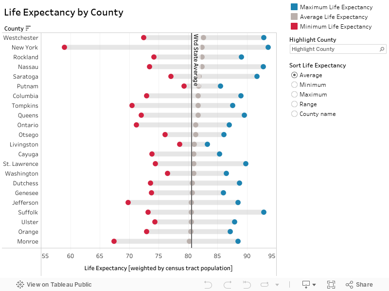
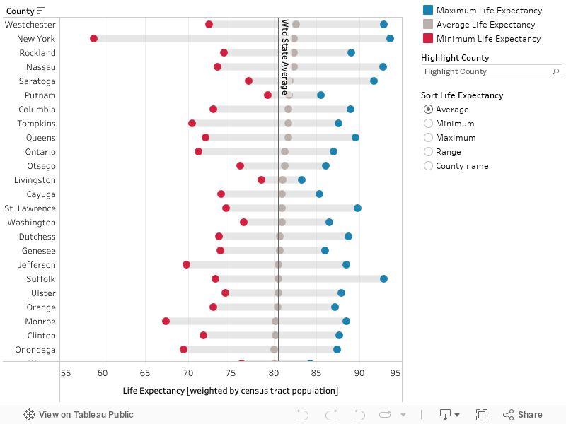
Range of Life Expectancies for Census Tracts within Each County
There is Wide Variation in Life Expectancy within Counties
Figure 2 examines the range of life expectancies by census tract within counties. On average, there is approximately a 20% difference between the census tracts with the longest and shortest life expectancies across all counties. (Note: in Figure 2 and the following analysis, only counties with a population greater than 50,000 and more than 10 census tracts are included, as counties with fewer tracts can distort the results.)
The county with the least difference between its census tracts with the shortest and longest life expectancies is Livingston County, with a range of 78.6 years to 83.3 years (a difference of 4.7 years, or 6.0%). The county with the largest difference between its census tracts with the shortest and longest life expectancies is New York County, with a range of 59.0 years to 93.6 years (a difference of 34.6 years, or 58.6%). All counties contain census tracts that have life expectancies both longer and shorter than the statewide average (represented by the vertical dashed blue line at 80.6 years).
Figure 2. Range of Life Expectancies for Census Tracts within Each County
var divElement = document.getElementById(‘viz1589392440799’); var vizElement = divElement.getElementsByTagName(‘object’)[0]; vizElement.style.width=’100%’;vizElement.style.height=(divElement.offsetWidth*0.75)+’px’; var scriptElement = document.createElement(‘script’); scriptElement.src = ‘https://public.tableau.com/javascripts/api/viz_v1.js’; vizElement.parentNode.insertBefore(scriptElement, vizElement);
Source: Life expectancy data are available at: https://www.cdc.gov/nchs/nvss/usaleep/usaleep.html. Census tract population data are available from U.S. Census Bureau, 2011 through 2015 American Community Survey 5-Year Estimates, table B01003.
Note: Life expectancy data span mortality and population data from 2010 through 2015. Only census tracts with available life expectancy estimates are included in the analysis (n=4,547). Counties are ordered by their average life expectancy. The statewide average is calculated based on a population-weighted average of the census tract life expectancy estimates. The county averages are similarly population weighted. Only counties with a population greater than 50,000 and more than 10 census tracts are included in the analysis, as counties with few tracts can distort any analysis of intra-county variations.
Distribution of County Populations by Life Expectancy Quintile
Table 2 displays the distribution of each county’s population across life expectancy quintiles, which are based on the distribution of census tracts across the State. A county with a life expectancy distribution similar to the distribution across the State would have approximately 20% of its population within each quintile.
However, many counties have populations that are skewed toward census tracts with longer life expectancies. The two counties with the largest share of their populations in the top life expectancy quintile are Rockland and Westchester counties, with 43% and 42% of their populations, respectively, having an estimated life expectancy that is longer than 80% of the State’s.
There are also counties with populations that are skewed toward census tracts with shorter life expectancies. The county with the largest share of its population in the bottom life expectancy quintile is the Bronx, with 46% of its population having an estimated life expectancy shorter than 80% of the State’s.
The vast majority of counties have populations in each of the five life expectancy quintiles. However, there are counties—like Herkimer County—where no census tracts fall within the top life expectancy quintile. Other counties, such as Livingston County, do not have any census tracts in the bottom quintile. The counties with a narrower range of life expectancies tend to be those with a smaller population size and fewer census tracts.
Table 2. Distribution of County Populations by Life Expectancy Quintile
| County | Number of Census Tracts | Percentage of Population in Top Life Expectancy Quintile
(83.2–93.6) |
Percentage of Population in 2nd Life Expectancy Quintile
(81.3–83.2) |
Percentage of Population in 3rd Life Expectancy Quintile
(79.7–81.3) |
Percentage of Population in 4th Life Expectancy Quintile
(77.4–79.7) |
Percentage of Population in Bottom Life Expectancy Quintile
(59.0–77.4) |
| Albany | 67 | 16% | 12% | 30% | 21% | 22% |
| Bronx | 315 | 7% | 13% | 14% | 21% | 46% |
| Broome | 49 | 13% | 16% | 21% | 31% | 19% |
| Cattaraugus | 19 | 8% | 15% | 29% | 15% | 32% |
| Cayuga | 19 | 28% | 22% | 15% | 23% | 12% |
| Chautauqua | 34 | 4% | 13% | 30% | 26% | 27% |
| Chemung | 21 | 6% | 16% | 14% | 38% | 26% |
| Clinton | 16 | 28% | 7% | 23% | 13% | 28% |
| Columbia | 20 | 32% | 9% | 38% | 4% | 18% |
| Dutchess | 74 | 17% | 30% | 17% | 21% | 16% |
| Erie | 221 | 7% | 12% | 22% | 23% | 36% |
| Franklin | 14 | 11% | 9% | 24% | 18% | 37% |
| Fulton | 15 | 13% | 27% | 17% | 7% | 36% |
| Genesee | 14 | 28% | 9% | 20% | 26% | 18% |
| Herkimer | 19 | 0% | 27% | 29% | 30% | 14% |
| Jefferson | 22 | 32% | 18% | 0% | 32% | 18% |
| Kings | 712 | 16% | 23% | 18% | 20% | 24% |
| Livingston | 13 | 9% | 34% | 30% | 27% | 0% |
| Monroe | 176 | 23% | 19% | 18% | 19% | 22% |
| Nassau | 269 | 33% | 30% | 28% | 7% | 3% |
| New York | 237 | 39% | 28% | 9% | 12% | 12% |
| Niagara | 58 | 5% | 12% | 23% | 23% | 37% |
| Oneida | 64 | 16% | 15% | 20% | 23% | 27% |
| Onondaga | 130 | 20% | 23% | 17% | 19% | 22% |
| Ontario | 25 | 33% | 25% | 9% | 20% | 14% |
| Orange | 75 | 19% | 20% | 15% | 31% | 15% |
| Oswego | 28 | 9% | 15% | 23% | 27% | 26% |
| Otsego | 15 | 17% | 45% | 4% | 27% | 8% |
| Putnam | 17 | 16% | 47% | 17% | 20% | 0% |
| Queens | 620 | 31% | 26% | 17% | 17% | 10% |
| Rensselaer | 41 | 7% | 22% | 28% | 19% | 23% |
| Richmond | 102 | 12% | 15% | 33% | 18% | 21% |
| Rockland | 64 | 43% | 26% | 17% | 6% | 8% |
| Saratoga | 48 | 41% | 12% | 11% | 34% | 3% |
| Schenectady | 43 | 16% | 8% | 22% | 20% | 34% |
| St. Lawrence | 25 | 29% | 8% | 21% | 28% | 14% |
| Steuben | 29 | 7% | 17% | 31% | 25% | 20% |
| Suffolk | 307 | 11% | 22% | 31% | 29% | 7% |
| Sullivan | 23 | 11% | 10% | 14% | 55% | 11% |
| Tompkins | 17 | 25% | 44% | 0% | 23% | 8% |
| Ulster | 41 | 24% | 13% | 13% | 36% | 14% |
| Warren | 18 | 7% | 17% | 31% | 31% | 13% |
| Washington | 17 | 31% | 0% | 38% | 13% | 17% |
| Wayne | 21 | 9% | 28% | 22% | 23% | 18% |
| Westchester | 208 | 42% | 27% | 14% | 9% | 8% |
Source: Life expectancy data are available at: https://www.cdc.gov/nchs/nvss/usaleep/usaleep.html. Census tract population data are available from U.S. Census Bureau, 2011 through 2015 American Community Survey 5-Year Estimates, table B01003.
Notes: Life expectancy data spans mortality and population data from 2010 through 2015. Only census tracts with available life expectancy estimates are included in the analysis (n=4,547). The life expectancy quintiles are based on the statewide distribution of life expectancy across census tracts.
Life Expectancy Variation Within Counties
Range of Life Expectancies for Census Tracts within Each County
There is Wide Variation in Life Expectancy within Counties
Figure 2 examines the range of life expectancies by census tract within counties. On average, there is approximately a 20% difference between the census tracts with the longest and shortest life expectancies across all counties. (Note: in Figure 2 and the following analysis, only counties with a population greater than 50,000 and more than 10 census tracts are included, as counties with fewer tracts can distort the results.)
The county with the least difference between its census tracts with the shortest and longest life expectancies is Livingston County, with a range of 78.6 years to 83.3 years (a difference of 4.7 years, or 6.0%). The county with the largest difference between its census tracts with the shortest and longest life expectancies is New York County, with a range of 59.0 years to 93.6 years (a difference of 34.6 years, or 58.6%). All counties contain census tracts that have life expectancies both longer and shorter than the statewide average (represented by the vertical solid black line at 80.6 years).
Figure 2. Range of Life Expectancies for Census Tracts within Each County
var divElement = document.getElementById(‘viz1603299371985’); var vizElement = divElement.getElementsByTagName(‘object’)[0]; vizElement.style.width=’100%’;vizElement.style.height=(divElement.offsetWidth*0.75)+’px’; var scriptElement = document.createElement(‘script’); scriptElement.src = ‘https://public.tableau.com/javascripts/api/viz_v1.js’; vizElement.parentNode.insertBefore(scriptElement, vizElement);
Source: Life expectancy data are available at: https://www.cdc.gov/nchs/nvss/usaleep/usaleep.html. Census tract population data are available from U.S. Census Bureau, 2011 through 2015 American Community Survey 5-Year Estimates, table B01003.
Note: Life expectancy data span mortality and population data from 2010 through 2015. Only census tracts with available life expectancy estimates are included in the analysis (n=4,547). The statewide average is calculated based on a population-weighted average of the census tract life expectancy estimates. The county averages are similarly population weighted. Only counties with a population greater than 50,000 and more than 10 census tracts are included in the analysis, as counties with few tracts can distort any analysis of intra-county variations.
Distribution of County Populations by Life Expectancy Quintile
Table 2 displays the distribution of each county’s population across life expectancy quintiles, which are based on the distribution of census tracts across the State. A county with a life expectancy distribution similar to the distribution across the State would have approximately 20% of its population within each quintile.
However, many counties have populations that are skewed toward census tracts with longer life expectancies. The two counties with the largest share of their populations in the top life expectancy quintile are Rockland and Westchester counties, with 43% and 42% of their populations, respectively, having an estimated life expectancy that is longer than 80% of the State’s.
There are also counties with populations that are skewed toward census tracts with shorter life expectancies. The county with the largest share of its population in the bottom life expectancy quintile is the Bronx, with 46% of its population having an estimated life expectancy shorter than 80% of the State’s.
The vast majority of counties have populations in each of the five life expectancy quintiles. However, there are counties—like Herkimer County—where no census tracts fall within the top life expectancy quintile. Other counties, such as Livingston County, do not have any census tracts in the bottom quintile. The counties with a narrower range of life expectancies tend to be those with a smaller population size and fewer census tracts.
Table 2. Distribution of County Populations by Life Expectancy Quintile
!function(e,i,n,s){var t=”InfogramEmbeds”,d=e.getElementsByTagName(“script”)[0];if(window[t]&&window[t].initialized)window[t].process&&window[t].process();else if(!e.getElementById(n)){var o=e.createElement(“script”);o.async=1,o.id=n,o.src=”https://e.infogram.com/js/dist/embed-loader-min.js”,d.parentNode.insertBefore(o,d)}}(document,0,”infogram-async”);
Source: Life expectancy data are available at: https://www.cdc.gov/nchs/nvss/usaleep/usaleep.html. Census tract population data are available from U.S. Census Bureau, 2011 through 2015 American Community Survey 5-Year Estimates, table B01003.
Notes: Life expectancy data spans mortality and population data from 2010 through 2015. Only census tracts with available life expectancy estimates are included in the analysis (n=4,547). The life expectancy quintiles are based on the statewide distribution of life expectancy across census tracts.
Range of Life Expectancies for Census Tracts within Each County
There is Wide Variation in Life Expectancy within Counties
Figure 2 examines the range of life expectancies by census tract within counties. On average, there is approximately a 20% difference between the census tracts with the longest and shortest life expectancies across all counties. (Note: in Figure 2 and the following analysis, only counties with a population greater than 50,000 and more than 10 census tracts are included, as counties with fewer tracts can distort the results.)
The county with the least difference between its census tracts with the shortest and longest life expectancies is Livingston County, with a range of 78.6 years to 83.3 years (a difference of 4.7 years, or 6.0%). The county with the largest difference between its census tracts with the shortest and longest life expectancies is New York County, with a range of 59.0 years to 93.6 years (a difference of 34.6 years, or 58.6%). All counties contain census tracts that have life expectancies both longer and shorter than the statewide average (represented by the vertical solid black line at 80.6 years).
Figure 2. Range of Life Expectancies for Census Tracts within Each County
var divElement = document.getElementById(‘viz1603207018656’); var vizElement = divElement.getElementsByTagName(‘object’)[0]; vizElement.style.width=’100%’;vizElement.style.height=(divElement.offsetWidth*0.75)+’px’; var scriptElement = document.createElement(‘script’); scriptElement.src = ‘https://public.tableau.com/javascripts/api/viz_v1.js’; vizElement.parentNode.insertBefore(scriptElement, vizElement);
Source: Life expectancy data are available at: https://www.cdc.gov/nchs/nvss/usaleep/usaleep.html. Census tract population data are available from U.S. Census Bureau, 2011 through 2015 American Community Survey 5-Year Estimates, table B01003.
Note: Life expectancy data span mortality and population data from 2010 through 2015. Only census tracts with available life expectancy estimates are included in the analysis (n=4,547). The statewide average is calculated based on a population-weighted average of the census tract life expectancy estimates. The county averages are similarly population weighted. Only counties with a population greater than 50,000 and more than 10 census tracts are included in the analysis, as counties with few tracts can distort any analysis of intra-county variations.
Distribution of County Populations by Life Expectancy Quintile
Table 2 displays the distribution of each county’s population across life expectancy quintiles, which are based on the distribution of census tracts across the State. A county with a life expectancy distribution similar to the distribution across the State would have approximately 20% of its population within each quintile.
However, many counties have populations that are skewed toward census tracts with longer life expectancies. The two counties with the largest share of their populations in the top life expectancy quintile are Rockland and Westchester counties, with 43% and 42% of their populations, respectively, having an estimated life expectancy that is longer than 80% of the State’s.
There are also counties with populations that are skewed toward census tracts with shorter life expectancies. The county with the largest share of its population in the bottom life expectancy quintile is the Bronx, with 46% of its population having an estimated life expectancy shorter than 80% of the State’s.
The vast majority of counties have populations in each of the five life expectancy quintiles. However, there are counties—like Herkimer County—where no census tracts fall within the top life expectancy quintile. Other counties, such as Livingston County, do not have any census tracts in the bottom quintile. The counties with a narrower range of life expectancies tend to be those with a smaller population size and fewer census tracts.
Table 2. Distribution of County Populations by Life Expectancy Quintile
Source: Life expectancy data are available at: https://www.cdc.gov/nchs/nvss/usaleep/usaleep.html. Census tract population data are available from U.S. Census Bureau, 2011 through 2015 American Community Survey 5-Year Estimates, table B01003.
Notes: Life expectancy data spans mortality and population data from 2010 through 2015. Only census tracts with available life expectancy estimates are included in the analysis (n=4,547). The life expectancy quintiles are based on the statewide distribution of life expectancy across census tracts.
Life Expectancy & Income
The Relationship Between Life Expectancy and Income
Communities with Longer Life Expectancies Are Associated with Higher Incomes
Prior research has documented the strong relationship between income and life expectancy.[1] This relationship holds in New York State (Figure 3). Nearly 40% of residents in census tracts with the longest life expectancies have household incomes of $100,000 or more. In contrast, only 12% of residents in the census tracts with the shortest life expectancies have household incomes of $100,000 or more.
Figure 3. Distribution of Population in Life Expectancy Quintiles by Household Income
!function(e,i,n,s){var t=”InfogramEmbeds”,d=e.getElementsByTagName(“script”)[0];if(window[t]&&window[t].initialized)window[t].process&&window[t].process();else if(!e.getElementById(n)){var o=e.createElement(“script”);o.async=1,o.id=n,o.src=”https://e.infogram.com/js/dist/embed-loader-min.js”,d.parentNode.insertBefore(o,d)}}(document,0,”infogram-async”);
Source: Life expectancy data are available at: https://www.cdc.gov/nchs/nvss/usaleep/usaleep.html. Household income data are from U.S. Census Bureau, 2011-2015 American Community Survey 5-Year Estimates.
Notes: Life expectancy data span mortality and population data from 2010 through 2015. Only census tracts with available life expectancy estimates are included in the analysis (n=4,547). The household income data span survey responses from 2011 through 2015.
[1] Chetty R, Stepner M, Abraham S, et al. The Association Between Income and Life Expectancy in the United States, 2001-2014. JAMA. 2016;315(16):1750–1766. doi:10.1001/jama.2016.4226
Life Expectancy & Socioeconomic Status
The Relationship Between Life Expectancy and Socioeconomic Status
Communities with Shorter Life Expectancies Are Associated with a Lower Socioeconomic Status
The Area Deprivation Index, or ADI, is a composite measure of the socioeconomic status (SES) of an area. ADI is calculated using measures for income, education, employment, and housing quality. See the Methods section for more details.
Consistent with the results for income, the composite SES variable shows that New Yorkers in census tracts with the longest life expectancies are more likely to live in an advantaged SES neighborhood (Figure 4). Nearly half (49%) of residents in census tracts with the longest life expectancies live in advantaged SES neighborhoods. In contrast, more than half (60%) of residents in census tracts with the shortest life expectancies live in disadvantaged SES neighborhoods.
Figure 4. Distribution of Population in Life Expectancy Quintiles by Socioeconomic Status
Source: Life expectancy data are available at: https://www.cdc.gov/nchs/nvss/usaleep/usaleep.html. Area Deprivation Index (ADI) data are available at: https://www.neighborhoodatlas.medicine.wisc.edu/. Census block group and census tract population data are available at: 2011-2015 American Community Survey 5-Year Estimates.
Notes: Life expectancy data span mortality and population data from 2010 through 2015. Only census tracts with available life expectancy estimates are included in the analysis (n=4,547). The ADI data span survey responses from 2011 through 2015.
Life Expectancy & Race/Ethnicity
The Relationship Between Life Expectancy and Race/Ethnicity
Communities with Shorter Life Expectancies Are Associated with a Larger Proportion of Racial and Ethnic Minorities
In New York, non-Hispanic white New Yorkers make up 64% of the population in census tracts with the longest life expectancies, but only 35% of the population in census tracts with the shortest life expectancies (Figure 5). The opposite trend is true among Hispanic or Latino and Black or African-American New Yorkers, who comprise a relatively smaller proportion of the population in census tracts with the longest life expectancies (14% for Hispanic or Latino and 7% for Black or African American) and a larger proportion in census tracts with the shortest life expectancies (28% for Hispanic or Latino and 30% for Black or African American).
Figure 5. Distribution of Population in Life Expectancy Quintiles by Race/Ethnicity
Source: Life expectancy data are available at: https://www.cdc.gov/nchs/nvss/usaleep/usaleep.html. Race and ethnicity data are available at: U.S. Census Bureau, 2011-2015 American Community Survey 5-Year Estimates.
Notes: Life expectancy data span mortality and population data from 2010 through 2015. Only census tracts with available life expectancy estimates are included in the analysis (n=4,547). The race and ethnicity data span survey responses from 2011 through 2015. “Other” category contains the American Indian and Alaska Native, Native Hawaiian and Other Pacific Islander, Other Race, and Two or More Races categories.
Life Expectancy & Education
The Relationship Between Life Expectancy and Education
Communities with Longer Life Expectancies Are Associated with a Greater Proportion of College Graduates
Consistent with the notion that more education is associated with longer life expectancies, census tracts with the longest life expectancy estimates include a greater proportion of New Yorkers who have graduated college (Figure 6). Nearly half (45%) of New Yorkers in census tracts in the top quintile for life expectancies have a bachelor’s degree or higher. In contrast, among those in census tracts with the lowest life expectancies, fewer than one in five residents (18%) have a bachelor’s degree or higher.
Figure 6. Percent of Population with Bachelor’s Degree or Higher by Life Expectancy Quintile
Source: Life expectancy data are available at: https://www.cdc.gov/nchs/nvss/usaleep/usaleep.html. Education data are available at: U.S. Census Bureau, 2011-2015 American Community Survey 5-Year Estimates.
Notes: Life expectancy data span mortality and population data from 2010 through 2015. Only census tracts with available life expectancy estimates are included in the analysis (n=4,547). The education data span survey responses from 2011 through 2015.
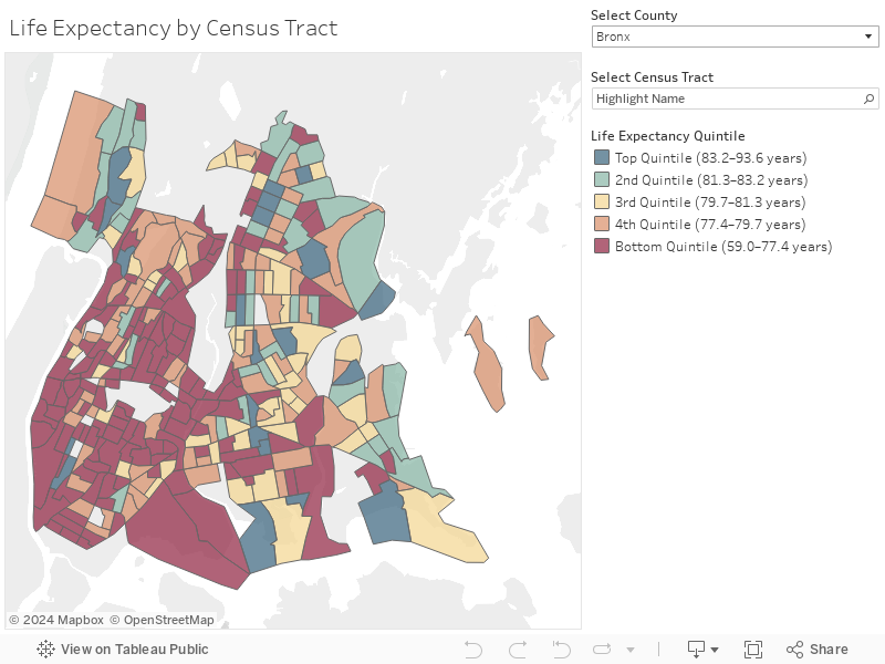
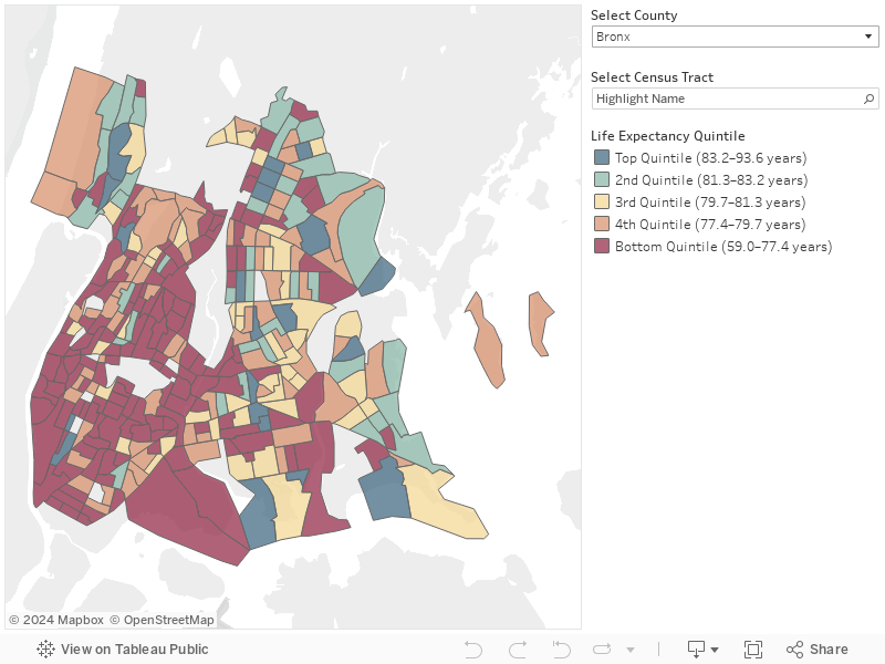
A Deeper Look at the Bronx
Given the wide variation of life expectancies even across census tracts that are within a short distance of each other, factors aside from socioeconomic status and demographics may play an important role in determining longevity. Consider the complex patterns within Bronx County. Overall, Bronx County has the second-lowest life expectancy in New York State (78.3 years). Nearly half of Bronx County residents live in a census tract with a life expectancy estimate shorter than 80% of the State’s, indicated in dark red in Figure 7.
Despite its short life expectancy for the county overall, the Bronx contains census tracts that have long life expectancies in the top quintile of the statewide distribution. Predictably, many of these long life expectancy census tracts have relatively higher incomes and larger proportions of white residents.
However, there are also census tracts that run counter to these typical patterns. That is, there are census tracts with life expectancy estimates in the top quintile statewide that have relatively low incomes and a high level of racial and ethnic diversity. Examining the geospacial distribution of these census tracts across the Bronx may provide insight into the mechanisms influencing their better-than-predicted life expectancy.
Figure 7. Life Expectancy in the Bronx by Census Tract
var divElement = document.getElementById(‘viz1589305967069’); var vizElement = divElement.getElementsByTagName(‘object’)[0]; vizElement.style.width=’100%’;vizElement.style.height=(divElement.offsetWidth*0.75)+’px’; var scriptElement = document.createElement(‘script’); scriptElement.src = ‘https://public.tableau.com/javascripts/api/viz_v1.js’; vizElement.parentNode.insertBefore(scriptElement, vizElement);
Source: Life expectancy data are available at: https://www.cdc.gov/nchs/nvss/usaleep/usaleep.html.
Notes: Life expectancy data span mortality and population data from 2010 through 2015. Only census tracts with available life expectancy estimates are included in the analysis (n=315).
Other Factors Influencing Life Expectancy
The “Spillover” Effect
Census tracts 285 and 287 are located within the Kingsbridge neighborhood of the northwest Bronx. Both tracts have life expectancy estimates in the top 40% of the State, despite having median household incomes below $55,000. The high life expectancy in these communities relative to household income may be attributable in part to their proximity to more affluent census tracts in the neighboring Riverdale and Fieldston communities, where median household incomes are greater than $80,000 and the majority of residents are white.
It is possible that the longer life expectancies of Kingsbridge residents may be in part influenced by their proximity to more advantaged SES neighborhoods. For example, the higher-income neighborhoods may be able to secure greater investments in parks, schools, and public infrastructure (e.g., walkable sidewalks, high-functioning public transportation). Although prior research has shown that spillover effects on mortality rates are possible from SES and social capital (e.g., size of social networks) characteristics of neighboring communities, the effects are not always positive.[1] More research is needed to determine when and how such characteristics can offer protective qualities to neighboring communities that are socioeconomically disadvantaged.
More than Just Socioeconomic Factors
Census tracts 183.01 and 61 are located within the Concourse Village neighborhood of the southwest Bronx. Both tracts have life expectancy estimates that rank in the top 20% of the State, despite having median household incomes below $50,000, disadvantaged SES levels (as measured by the ADI), and majority minority populations.
Unlike the Kingsbridge census tracts, the Concourse Village neighborhoods are surrounded by census tracts in the lowest quintiles of life expectancy. Hence, it is unlikely they benefit from positive externalities from more socioeconomically advantaged neighbors. Rather, these census tracts provide evidence that factors beyond socioeconomic status may significantly influence life expectancy.
Existing literature points to several factors that may contribute to these higher life expectancies. One study finds that geographic variation in life expectancy for low-income populations is more highly correlated with health behaviors (particularly those related to smoking, weight, and physical activity) than any other factors, including access to medical care, physical environmental factors, income inequality, or labor market conditions.[2] Consistent with the importance of health behaviors, a study of county-level variation in life expectancy over time finds that the relationship between income and life expectancy is largely explained by changes in smoking rates.[3] Other scholars attribute high life expectancies in New York City to the high proportion of immigrants, who have higher life expectancies than their native-born counterparts.[4] Census tracts like these in Concourse Village should be studied to better understand the constellation of factors that influence life expectancy.
[1] Yang, T. C., Noah, A., & Shoff, C. (2015). Exploring geographic variation in US mortality rates using a spatial Durbin approach. Population, space and place, 21(1), 18–37. https://doi.org/10.1002/psp.1809.
[2] Chetty R, Stepner M, Abraham S, et al. The Association Between Income and Life Expectancy in the United States, 2001-2014. JAMA. 2016;315(16):1750–1766. doi:10.1001/jama.2016.4226.
[3] Maxim Pinkovskiy, “Does U.S. Health Inequality Reflect Income Inequality—or Something Else?,” Federal Reserve Bank of New York Liberty Street Economics, October 15, 2019, https://libertystreeteconomics.newyorkfed.org/2019/10/does-us-health-inequality-reflect-income-Inequality-or-something-else.html.
[4] Preston, Samuel H., and Irma T. Elo. “Anatomy of a municipal triumph: New York City’s upsurge in life expectancy.” Population and development review 40.1 (2014): 1-29.
A Closer Look at the Bronx
A Closer Look at the Bronx
Given the wide variation of life expectancies even across census tracts that are within a short distance of each other, factors aside from socioeconomic status and demographics may play an important role in determining longevity. Consider the complex patterns within Bronx County. Overall, Bronx County has the second-lowest life expectancy in New York State (78.3 years). Nearly half of Bronx County residents live in a census tract with a life expectancy estimate shorter than 80% of the State’s, indicated in dark red in Figure 7.
Despite its short life expectancy for the county overall, the Bronx contains census tracts that have long life expectancies in the top quintile of the statewide distribution. Predictably, many of these long life expectancy census tracts have relatively higher incomes and larger proportions of white residents.
However, there are also census tracts that run counter to these typical patterns. That is, there are census tracts with life expectancy estimates in the top quintile statewide that have relatively low incomes and a high level of racial and ethnic diversity. Examining the geospacial distribution of these census tracts across the Bronx may provide insight into the mechanisms influencing their better-than-predicted life expectancy.
Figure 7. Life Expectancy in the Bronx by Census Tract
var divElement = document.getElementById(‘viz1603207087450’); var vizElement = divElement.getElementsByTagName(‘object’)[0]; vizElement.style.width=’100%’;vizElement.style.height=(divElement.offsetWidth*0.75)+’px’; var scriptElement = document.createElement(‘script’); scriptElement.src = ‘https://public.tableau.com/javascripts/api/viz_v1.js’; vizElement.parentNode.insertBefore(scriptElement, vizElement);
Source: Life expectancy data are available at: https://www.cdc.gov/nchs/nvss/usaleep/usaleep.html.
Notes: Life expectancy data span mortality and population data from 2010 through 2015. Only census tracts with available life expectancy estimates are included in the analysis (n=315).
Other Factors Influencing Life Expectancy
The “Spillover” Effect
Census tracts 285 and 287 are located within the Kingsbridge neighborhood of the northwest Bronx. Both tracts have life expectancy estimates in the top 40% of the State, despite having median household incomes below $55,000. The high life expectancy in these communities relative to household income may be attributable in part to their proximity to more affluent census tracts in the neighboring Riverdale and Fieldston communities, where median household incomes are greater than $80,000 and the majority of residents are white.
It is possible that the longer life expectancies of Kingsbridge residents may be in part influenced by their proximity to more advantaged SES neighborhoods. For example, the higher-income neighborhoods may be able to secure greater investments in parks, schools, and public infrastructure (e.g., walkable sidewalks, high-functioning public transportation). Although prior research has shown that spillover effects on mortality rates are possible from SES and social capital (e.g., size of social networks) characteristics of neighboring communities, the effects are not always positive.[1] More research is needed to determine when and how such characteristics can offer protective qualities to neighboring communities that are socioeconomically disadvantaged.
More than Just Socioeconomic Factors
Census tracts 183.01 and 61 are located within the Concourse Village neighborhood of the southwest Bronx. Both tracts have life expectancy estimates that rank in the top 20% of the State, despite having median household incomes below $50,000, disadvantaged SES levels (as measured by the ADI), and majority minority populations.
Unlike the Kingsbridge census tracts, the Concourse Village neighborhoods are surrounded by census tracts in the lowest quintiles of life expectancy. Hence, it is unlikely they benefit from positive externalities from more socioeconomically advantaged neighbors. Rather, these census tracts provide evidence that factors beyond socioeconomic status may significantly influence life expectancy.
Existing literature points to several factors that may contribute to these higher life expectancies. One study finds that geographic variation in life expectancy for low-income populations is more highly correlated with health behaviors (particularly those related to smoking, weight, and physical activity) than any other factors, including access to medical care, physical environmental factors, income inequality, or labor market conditions.[2] Consistent with the importance of health behaviors, a study of county-level variation in life expectancy over time finds that the relationship between income and life expectancy is largely explained by changes in smoking rates.[3] Other scholars attribute high life expectancies in New York City to the high proportion of immigrants, who have higher life expectancies than their native-born counterparts.[4] Census tracts like these in Concourse Village should be studied to better understand the constellation of factors that influence life expectancy.
[1] Yang, T. C., Noah, A., & Shoff, C. (2015). Exploring geographic variation in US mortality rates using a spatial Durbin approach. Population, space and place, 21(1), 18–37. https://doi.org/10.1002/psp.1809.
[2] Chetty R, Stepner M, Abraham S, et al. The Association Between Income and Life Expectancy in the United States, 2001-2014. JAMA. 2016;315(16):1750–1766. doi:10.1001/jama.2016.4226.
[3] Maxim Pinkovskiy, “Does U.S. Health Inequality Reflect Income Inequality—or Something Else?,” Federal Reserve Bank of New York Liberty Street Economics, October 15, 2019, https://libertystreeteconomics.newyorkfed.org/2019/10/does-us-health-inequality-reflect-income-Inequality-or-something-else.html.
[4] Preston, Samuel H., and Irma T. Elo. “Anatomy of a municipal triumph: New York City’s upsurge in life expectancy.” Population and development review 40.1 (2014): 1-29.
A Deeper Look at the Bronx
Given the wide variation of life expectancies even across census tracts that are within a short distance of each other, factors aside from socioeconomic status and demographics may play an important role in determining longevity. Consider the complex patterns within Bronx County. Overall, Bronx County has the second-lowest life expectancy in New York State (78.3 years). Nearly half of Bronx County residents live in a census tract with a life expectancy estimate shorter than 80% of the State’s, indicated in dark red in Figure 7.
Despite its short life expectancy for the county overall, the Bronx contains census tracts that have long life expectancies in the top quintile of the statewide distribution. Predictably, many of these long life expectancy census tracts have relatively higher incomes and larger proportions of white residents.
However, there are also census tracts that run counter to these typical patterns. That is, there are census tracts with life expectancy estimates in the top quintile statewide that have relatively low incomes and a high level of racial and ethnic diversity. Examining the geospacial distribution of these census tracts across the Bronx may provide insight into the mechanisms influencing their better-than-predicted life expectancy.
Figure 7. Life Expectancy in the Bronx by Census Tract
var divElement = document.getElementById(‘viz1603207087450’); var vizElement = divElement.getElementsByTagName(‘object’)[0]; vizElement.style.width=’100%’;vizElement.style.height=(divElement.offsetWidth*0.75)+’px’; var scriptElement = document.createElement(‘script’); scriptElement.src = ‘https://public.tableau.com/javascripts/api/viz_v1.js’; vizElement.parentNode.insertBefore(scriptElement, vizElement);
Source: Life expectancy data are available at: https://www.cdc.gov/nchs/nvss/usaleep/usaleep.html.
Notes: Life expectancy data span mortality and population data from 2010 through 2015. Only census tracts with available life expectancy estimates are included in the analysis (n=315).
Other Factors Influencing Life Expectancy
The “Spillover” Effect
Census tracts 285 and 287 are located within the Kingsbridge neighborhood of the northwest Bronx. Both tracts have life expectancy estimates in the top 40% of the State, despite having median household incomes below $55,000. The high life expectancy in these communities relative to household income may be attributable in part to their proximity to more affluent census tracts in the neighboring Riverdale and Fieldston communities, where median household incomes are greater than $80,000 and the majority of residents are white.
It is possible that the longer life expectancies of Kingsbridge residents may be in part influenced by their proximity to more advantaged SES neighborhoods. For example, the higher-income neighborhoods may be able to secure greater investments in parks, schools, and public infrastructure (e.g., walkable sidewalks, high-functioning public transportation). Although prior research has shown that spillover effects on mortality rates are possible from SES and social capital (e.g., size of social networks) characteristics of neighboring communities, the effects are not always positive.[1] More research is needed to determine when and how such characteristics can offer protective qualities to neighboring communities that are socioeconomically disadvantaged.
More than Just Socioeconomic Factors
Census tracts 183.01 and 61 are located within the Concourse Village neighborhood of the southwest Bronx. Both tracts have life expectancy estimates that rank in the top 20% of the State, despite having median household incomes below $50,000, disadvantaged SES levels (as measured by the ADI), and majority minority populations.
Unlike the Kingsbridge census tracts, the Concourse Village neighborhoods are surrounded by census tracts in the lowest quintiles of life expectancy. Hence, it is unlikely they benefit from positive externalities from more socioeconomically advantaged neighbors. Rather, these census tracts provide evidence that factors beyond socioeconomic status may significantly influence life expectancy.
Existing literature points to several factors that may contribute to these higher life expectancies. One study finds that geographic variation in life expectancy for low-income populations is more highly correlated with health behaviors (particularly those related to smoking, weight, and physical activity) than any other factors, including access to medical care, physical environmental factors, income inequality, or labor market conditions.[2] Consistent with the importance of health behaviors, a study of county-level variation in life expectancy over time finds that the relationship between income and life expectancy is largely explained by changes in smoking rates.[3] Other scholars attribute high life expectancies in New York City to the high proportion of immigrants, who have higher life expectancies than their native-born counterparts.[4] Census tracts like these in Concourse Village should be studied to better understand the constellation of factors that influence life expectancy.
[1] Yang, T. C., Noah, A., & Shoff, C. (2015). Exploring geographic variation in US mortality rates using a spatial Durbin approach. Population, space and place, 21(1), 18–37. https://doi.org/10.1002/psp.1809.
[2] Chetty R, Stepner M, Abraham S, et al. The Association Between Income and Life Expectancy in the United States, 2001-2014. JAMA. 2016;315(16):1750–1766. doi:10.1001/jama.2016.4226.
[3] Maxim Pinkovskiy, “Does U.S. Health Inequality Reflect Income Inequality—or Something Else?,” Federal Reserve Bank of New York Liberty Street Economics, October 15, 2019, https://libertystreeteconomics.newyorkfed.org/2019/10/does-us-health-inequality-reflect-income-Inequality-or-something-else.html.
[4] Preston, Samuel H., and Irma T. Elo. “Anatomy of a municipal triumph: New York City’s upsurge in life expectancy.” Population and development review 40.1 (2014): 1-29.
Conclusion
Conclusion
Analyzing New Yorkers’ life expectancy at the census tract level reveals staggering variation in life expectancy across small geographic areas. Some of this variation can be explained by demographic and socioeconomic factors. For example, research has long shown that areas with higher household incomes benefit from increased life expectancy. However, some neighborhoods, like those examined in the Bronx, have high estimated life expectancies despite having a lower socioeconomic status and greater racial and ethnic diversity. The geospatial distribution of these neighborhoods suggests that some may be affected by their proximity to more advantaged areas and some may possess intrinsic factors that positively influence longevity. It is critical to study these influences upon life expectancy to achieve a future where all New Yorkers enjoy the same longevity.
Considering the importance of life expectancy as an indicator of the quality of life and health of communities, it is important for public health officials to track and publish the impact of the COVID-19 pandemic on life expectancy at the neighborhood level. Many of the neighborhoods in New York City hit hardest by COVID-19 were already those with the lowest life expectancy rates in the State.[1] Neighborhoods with a larger share of people of color and lower incomes have generally been the areas most harmed by the COVID-19 pandemic.[2] Thus, there is a substantial risk that the pandemic will increase disparities in life expectancy across the State by taking years of life away from the New Yorkers already expected to live the shortest
[1] New York City Department of Health and Mental Hygiene. Covid-19: Data. Accessed August 17, 2020 at: https://www1.nyc.gov/site/doh/covid/covid-19-data.page.
[2] Adhikari, S., Pantaleo, N. P., Feldman, J. M., Ogedegbe, O., Thorpe, L., & Troxel, A. B. (2020). Assessment of community-level disparities in coronavirus disease 2019 (COVID-19) infections and deaths in large US metropolitan areas. JAMA network open, 3(7), e2016938-e2016938.
A Deeper Look at the Bronx
Given the wide variation of life expectancies even across census tracts that are within a short distance of each other, factors aside from socioeconomic status and demographics may play an important role in determining longevity. Consider the complex patterns within Bronx County. Overall, Bronx County has the second-lowest life expectancy in New York State (78.3 years). Nearly half of Bronx County residents live in a census tract with a life expectancy estimate shorter than 80% of the State’s, indicated in dark red in Figure 7.
Despite its short life expectancy for the county overall, the Bronx contains census tracts that have long life expectancies in the top quintile of the statewide distribution. Predictably, many of these long life expectancy census tracts have relatively higher incomes and larger proportions of white residents.
However, there are also census tracts that run counter to these typical patterns. That is, there are census tracts with life expectancy estimates in the top quintile statewide that have relatively low incomes and a high level of racial and ethnic diversity. Examining the geospacial distribution of these census tracts across the Bronx may provide insight into the mechanisms influencing their better-than-predicted life expectancy.
Figure 7. Life Expectancy in the Bronx by Census Tract
var divElement = document.getElementById(‘viz1603207087450’); var vizElement = divElement.getElementsByTagName(‘object’)[0]; vizElement.style.width=’100%’;vizElement.style.height=(divElement.offsetWidth*0.75)+’px’; var scriptElement = document.createElement(‘script’); scriptElement.src = ‘https://public.tableau.com/javascripts/api/viz_v1.js’; vizElement.parentNode.insertBefore(scriptElement, vizElement);
Source: Life expectancy data are available at: https://www.cdc.gov/nchs/nvss/usaleep/usaleep.html.
Notes: Life expectancy data span mortality and population data from 2010 through 2015. Only census tracts with available life expectancy estimates are included in the analysis (n=315).
Other Factors Influencing Life Expectancy
The “Spillover” Effect
Census tracts 285 and 287 are located within the Kingsbridge neighborhood of the northwest Bronx. Both tracts have life expectancy estimates in the top 40% of the State, despite having median household incomes below $55,000. The high life expectancy in these communities relative to household income may be attributable in part to their proximity to more affluent census tracts in the neighboring Riverdale and Fieldston communities, where median household incomes are greater than $80,000 and the majority of residents are white.
It is possible that the longer life expectancies of Kingsbridge residents may be in part influenced by their proximity to more advantaged SES neighborhoods. For example, the higher-income neighborhoods may be able to secure greater investments in parks, schools, and public infrastructure (e.g., walkable sidewalks, high-functioning public transportation). Although prior research has shown that spillover effects on mortality rates are possible from SES and social capital (e.g., size of social networks) characteristics of neighboring communities, the effects are not always positive.[1] More research is needed to determine when and how such characteristics can offer protective qualities to neighboring communities that are socioeconomically disadvantaged.
More than Just Socioeconomic Factors
Census tracts 183.01 and 61 are located within the Concourse Village neighborhood of the southwest Bronx. Both tracts have life expectancy estimates that rank in the top 20% of the State, despite having median household incomes below $50,000, disadvantaged SES levels (as measured by the ADI), and majority minority populations.
Unlike the Kingsbridge census tracts, the Concourse Village neighborhoods are surrounded by census tracts in the lowest quintiles of life expectancy. Hence, it is unlikely they benefit from positive externalities from more socioeconomically advantaged neighbors. Rather, these census tracts provide evidence that factors beyond socioeconomic status may significantly influence life expectancy.
Existing literature points to several factors that may contribute to these higher life expectancies. One study finds that geographic variation in life expectancy for low-income populations is more highly correlated with health behaviors (particularly those related to smoking, weight, and physical activity) than any other factors, including access to medical care, physical environmental factors, income inequality, or labor market conditions.[2] Consistent with the importance of health behaviors, a study of county-level variation in life expectancy over time finds that the relationship between income and life expectancy is largely explained by changes in smoking rates.[3] Other scholars attribute high life expectancies in New York City to the high proportion of immigrants, who have higher life expectancies than their native-born counterparts.[4] Census tracts like these in Concourse Village should be studied to better understand the constellation of factors that influence life expectancy.
[1] Yang, T. C., Noah, A., & Shoff, C. (2015). Exploring geographic variation in US mortality rates using a spatial Durbin approach. Population, space and place, 21(1), 18–37. https://doi.org/10.1002/psp.1809.
[2] Chetty R, Stepner M, Abraham S, et al. The Association Between Income and Life Expectancy in the United States, 2001-2014. JAMA. 2016;315(16):1750–1766. doi:10.1001/jama.2016.4226.
[3] Maxim Pinkovskiy, “Does U.S. Health Inequality Reflect Income Inequality—or Something Else?,” Federal Reserve Bank of New York Liberty Street Economics, October 15, 2019, https://libertystreeteconomics.newyorkfed.org/2019/10/does-us-health-inequality-reflect-income-Inequality-or-something-else.html.
[4] Preston, Samuel H., and Irma T. Elo. “Anatomy of a municipal triumph: New York City’s upsurge in life expectancy.” Population and development review 40.1 (2014): 1-29.
Methods & Limitations
Methods & Limitations
Life Expectancy Data
The data used for the analysis are part of the U.S. Small-area Life Expectancy Estimates Project (USALEEP), which is conducted through a partnership between the Centers for Disease Control and Prevention (CDC), the Robert Wood Johnson Foundation (RWJF), and the National Association for Public Health Statistics and Information Systems (NAPHSIS). The data are available at:
- National Center for Health Statistics. U.S. Small-Area Life Expectancy Estimates Project (USALEEP): Life Expectancy Estimates File for New York, 2010–2015]. National Center for Health Statistics. 2018. Available from: https://www.cdc.gov/nchs/nvss/usaleep/usaleep.html
The USALEEP project produced estimates of life expectancy at birth—the average number of years a person can expect to live—for most of the census tracts in the United States for the period 2010–2015. Our analysis focuses on the 4,547 census tracts with available data in New York. Full documentation on how the life expectancy estimates are developed are available at:
- Arias E, Escobedo LA, Kennedy J, Fu C, Cisewski J. S. Small-area Life Expectancy Estimates Project: Methodology and Results Summary. National Center for Health Statistics. Vital Health Stat 2(181). 2018.
Rural/Urban Categories
Census tracts used for the analysis were categorized by their degree of urbanization and adjacency to a metro area using the U.S. Department of Agriculture’s 2013 Rural-Urban Continuum Codes (RUCC). To better identify trends in New York State, the codes were collapsed into 5 categories for analysis.
Full documentation on RUCC is available at:
- S. Department of Agriculture. Economic Research Service. “Rural-Urban Continuum Codes.” Available from: https://www.ers.usda.gov/data-products/rural-urban-continuum-codes.aspx
Area Deprivation Index
The Area Deprivation Index, or ADI, is based on a measure initially created by the Health Resources & Services Administration (HRSA). ADI is a composite measure of the socioeconomic status of an area that includes factors for the theoretical domains of income, education, employment, and housing quality. The current version of the ADI is measured at the level of the census block group (CBG). CBGs are the smallest census geographic area that encompasses the nation, and are typically bounded by visible features such as roads, streams, and railroad tracks, and by nonvisible boundaries such as property lines, city, township, school district, county limits, and short line-of-sight extensions of roads.
The most recent ADI calculation was done by a team of researchers at University of Wisconsin–Madison, led by Amy Kind, M.D., Ph.D. A national calculation shows how each CBG ranks in the national context (in both deciles and percentiles), and a state-level calculation shows the ADI ranks for each CBG calibrated within the state. We used the state-calibrated ADI measure and decile rankings; group 1 is the lowest ADI (least disadvantaged) and 10 is the highest ADI (most disadvantaged). We calculated a population-weighted average of the CBG ADI scores at the census tract level (each census tract comprises at least one CBG). We used CBG population estimates available from the U.S. Census American Community Survey.[1] Census tracts with an average ADI between 1 and 4 were categorized as “Advantaged SES,” between 4 and 7 as “Average SES,” and between 7 and 10 as “Disadvantaged SES.”
The data for the current ADI measure are based on 2011 through 2015 American Community Survey data and are a composite that incorporate the measures listed below. A complex statistical weighting scheme is used to develop the composite. Income and educational attainment are weighted more heavily in the composite, while social and housing measures are weighted slightly less.[2]
- Population aged 25 and older with less than 9 years of education
- Population aged 25 and older with at least a high school diploma
- Employed persons aged 16 and older in white-collar occupations
- Median family income in U.S. dollars
- Income disparity
- Median home value in U.S. dollars
- Median gross rent in U.S. dollars
- Median monthly mortgage in U.S. dollars
- Owner-occupied housing units
- Civilian labor force population aged 16 years and older who are unemployed
- Families below federal poverty level
- Population below 150% of the federal poverty threshold
- Single-parent households with children less than 18 years of age
- Households without a motor vehicle
- Households without a telephone
- Occupied housing units without complete plumbing
- Households with more than 1 person per room
For more information on the ADI, visit: https://www.neighborhoodatlas.medicine.wisc.edu/.
Limitations
The analyses conducted in this report of the relationships between life expectancy and income and other factors should not be interpreted as causal. Also, while robust reliability tests were conducted as part of the USALEEP project, it is possible that some census tracts, particularly with smaller sample sizes, have less reliable life expectancy estimates.